Editing the same image 4 different ways in Lightroom
I get a lot of questions about how I edit photos. I also get some criticism. Some people don’t like to edit their images, and that’s fine, but I personally love nothing more than to sit down at my computer with a fresh cup of coffee, put on some noise-cancelling headphones and select one of my editing playlists, and spend the next couple of hours playing around in Lightroom. As I enjoy this process so much, I’d like to share with you some of the ways that I create different moods by editing the same ocean image four different ways. The great thing about this Lightroom tutorial, is that I have only used four panels - the basics, tone curve, HSL, and split toning.
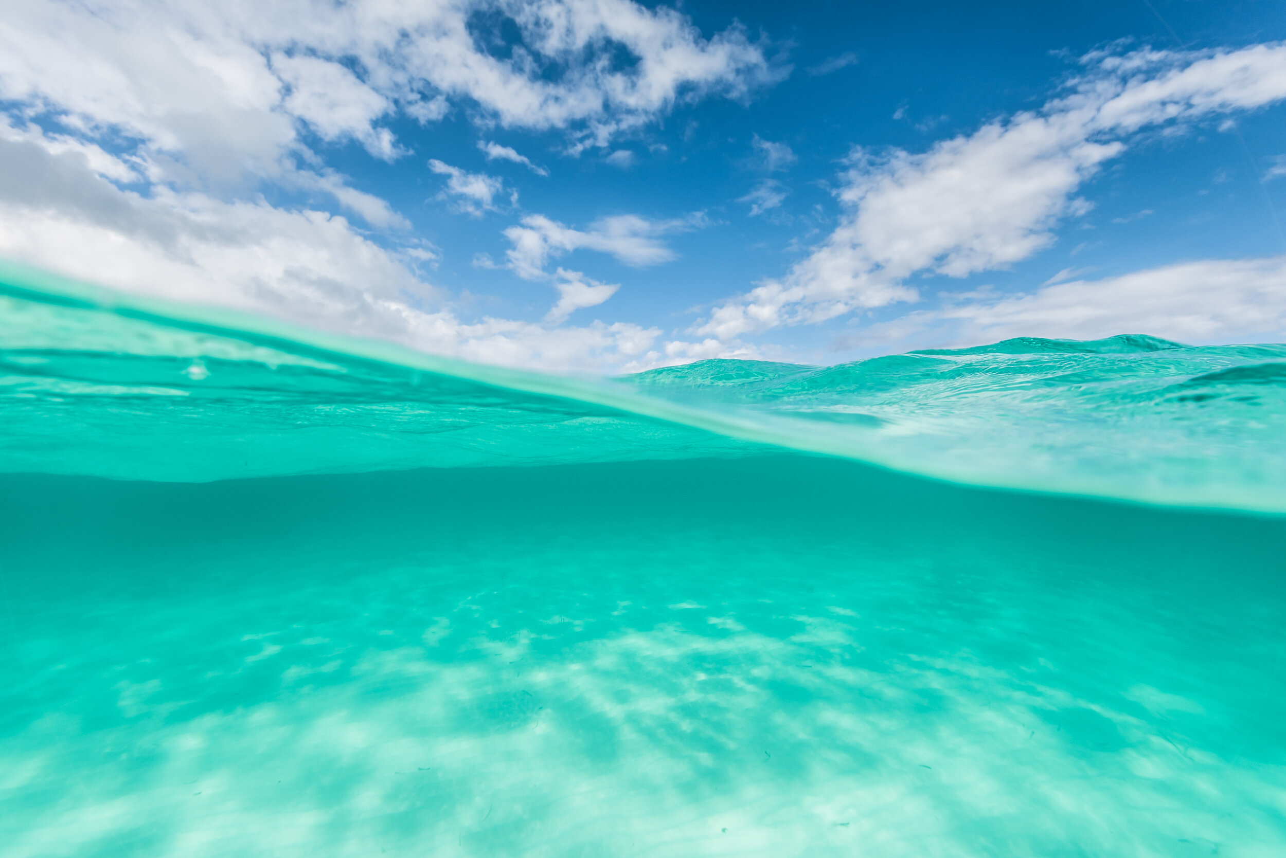
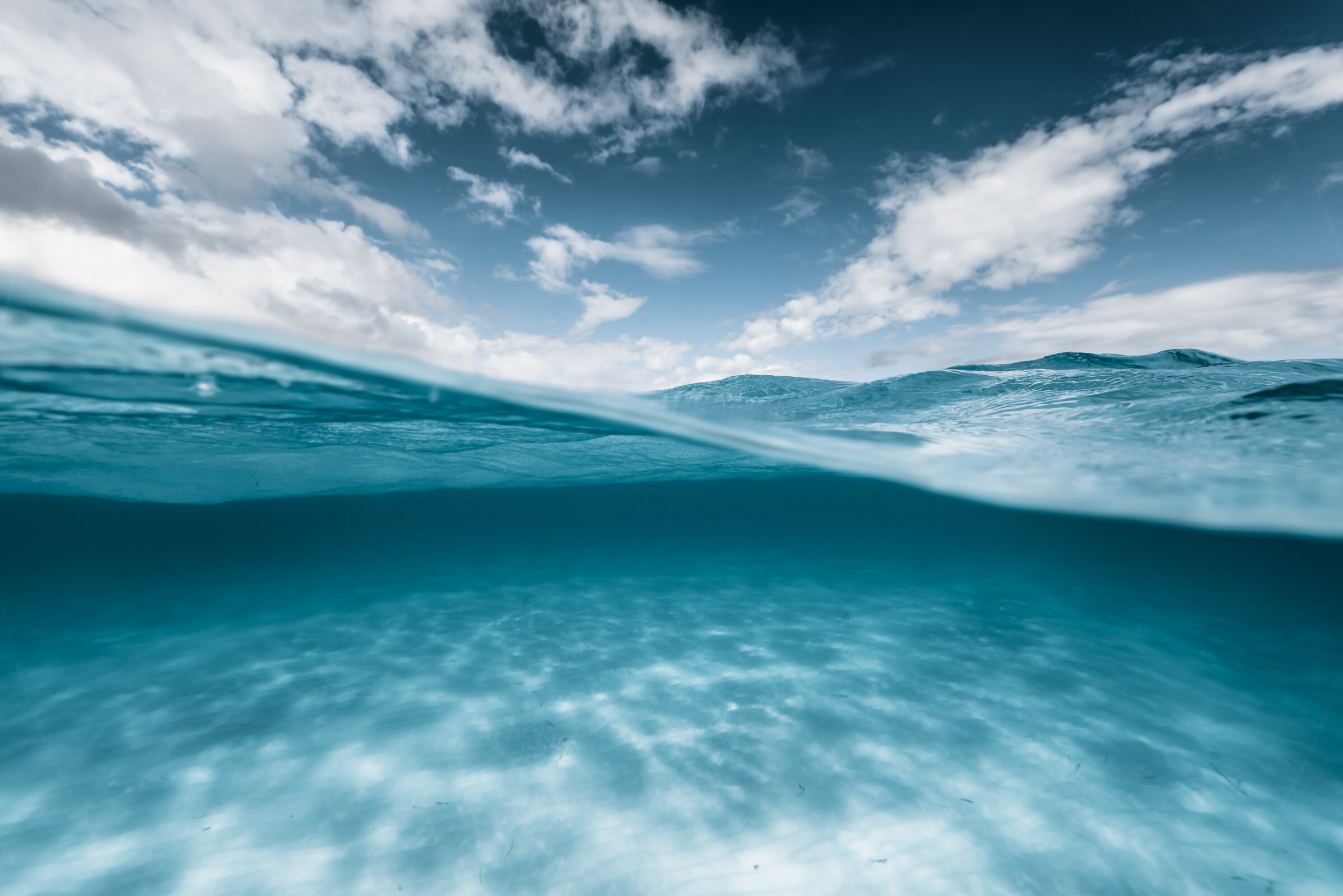
This is the RAW image straight from the camera that I chose to edit:

And here are the four different moods that I created by tweaking a few different settings in Lightroom:


This process incidentally has also forced me to name my edits, which I quite like. If you follow my work, you might recognise that I have used all of these styles on various images, and I seem to get great feedback on all of them, which is nice. The kind of edit that I choose varies day by day, and simply depends on what mood I’m in.
Without further ado, let’s get started with how I created these different edits.
EDIT #1 - TROPICAL PARADISE
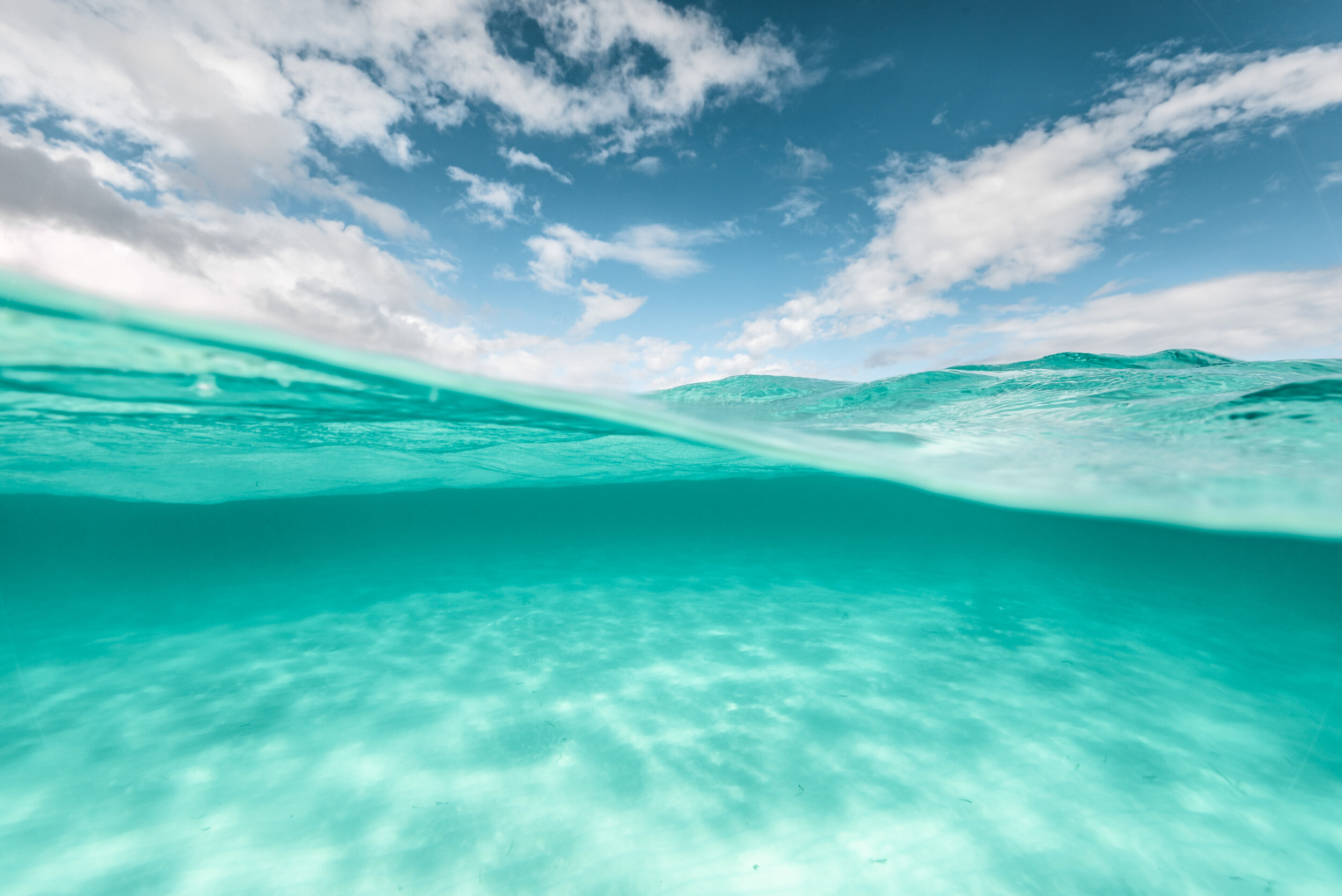
Basics panel
This is how the image looks when I made adjustments only to the basics panel. I’ve brightened the photo a little using the exposure slider as well as lifting the blacks and shadows. I rarely do this, as I usually like lots of contrast in my ocean photos but I was going for something a little different here and I think it works well. I’ve also pushed the clarity slider right up to +100, which is something I only do when editing underwater images, otherwise you run the risk of the photo looking too over-processed.


Tone curve
The next thing I did is add a little contrast by using a subtle S-curve within the tone curve panel.

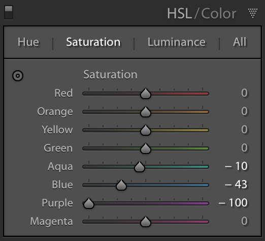
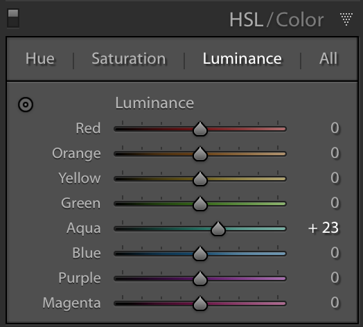
HSL
Next I adjusted the specific colours in the image. I do this using the HSL panel. In this image, there are only two colours present - aqua and blue. However, be aware that there is often green and purple in your blue hues, and sometimes yellow present where you might not realise, and this can also change depending on your white balance - if you warm your photo a lot then there’ll be some yellow or orange in your image.


Here I’ve made the blue slightly less purple and the aqua more blue. This gives a nice overall tropical blue tone that I love without the water looking too green. Then I desaturate them both a little and create some contrast between the two by increasing the luminance of the aqua and decreasing the luminance of the blue. I find this makes the ocean really stand out against the sky.
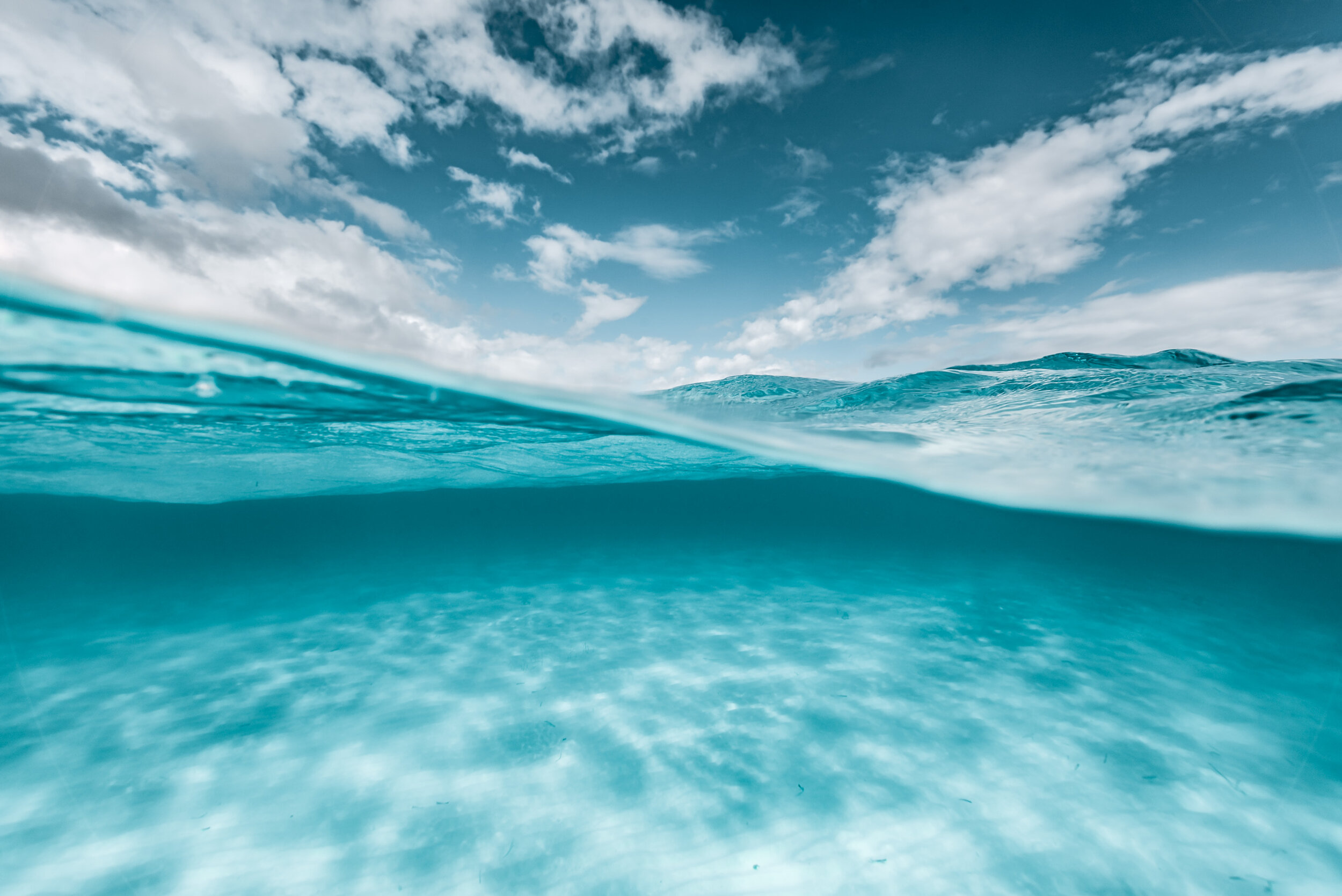
And there we have it. A few simple edits. This is the final image:

EDIT #2 - BRIGHT SUMMER
Basics panel
The major adjustments I made here were to create contrast between the blacks and whites. I also made the image a little warmer than the previous edit using the white balance sliders. I’ve chosen to use lots of clarity once again, but with this edit, I’ve also pushed the dehaze slider. This is a very important tool for ocean images, but can be easily overdone so use it sparingly. After you’ve dehazed, you might find that you then need to increase your overall exposure as well.


HSL
As I said previously, you might find that the colours in the image vary slightly if you’ve adjusted the white balance. This edit has more red in it than the previous edit, therefore there is a tiny bit of purple in the image. It’s very subtle, but I like to remove this purple (which tends to show up in the sky) by adding more blue to it and then desaturating it completely. I’ve then made the aqua more blue and the blue more aqua, desaturated them both a little and the brightened them up by increasing the luminance.


This is how the image looks after these adjustments:
Split toning
Since this edit is called Bright Summer, the final adjustment I made was to add a little warmth. I like to do this to the highlights using split toning. I will usually compliment this by adding some slight blue to the shadows as well. And this is the final image.


EDIT #3 - DARK STORM
Basics panel
For this edit, I wanted to create a cool and dark mood, as if a tropical storm were approaching. I used a cool temperature and added some red to the tint. Red is the first colour you lose underwater, and even though this water is very shallow, sometimes adding red can help the image to look a little more realistic. With this edit, I chose to decrease the overall contrast, which is something I usually do with underwater photos, as I find that it somehow brings more clarity to the seafloor. I can then accentuate this by bringing up the highlights and whites, and decreasing the shadows and blacks. I then added some overall clarity and desaturated the image to make it look more moody.


Tone curve
A strong S-curve is essential for this type of dark, moody edit. It looks pretty extreme without the final colour adjustments, but bear with me.


HSL
This is where the magic happens. As we’ve already established, with this particular image, there are only three colours present - aqua, blue and purple - so making adjustments to any of the other colours makes no difference to the photo.

You can see from the hue panel above that I’ve made the aqua much more blue, I’ve made the blue slightly more aqua, and I’ve pulled the purple all the way to the blue end. I’ve then completely desaturated the purple, and desaturated the blue and aqua as well. Finally, I brought some light to the seafloor by increasing the luminance of the aqua. All of these adjustments produces this final image:
EDIT #4 - ICY FRESH
Basics panel
This edit is fairly warm but still has a red tint. I’ve pulled down the highlights here, which is a great way to get detail back from clouds or bright skies. I’ve dehazed the image quite a lot, which consequently means I have to increase the exposure. Then I’ve added some more contrast by decreasing the blacks and bringing up the whites. Once again, I’ve added full overall clarity and desaturated the colours but increased their vibrancy. If you wish you add saturation to your photos, I would suggest trying this out to avoid making the image look too overdone.


Tone curve
I’ve only used the tone curve subtly this time, and actually added a slight matte effect to the photo by lifting the blacks from the very bottom. Sometimes this effect can look really cool, especially with portraits, but be careful not to overdo it.


HSL
I think this panel is my favourite. It’s really where the magic happens. So with this edit, I’m going for an icy blue feel so I’m going to do some similar adjustments as I did with the previous ‘dark storm’ edit. I’ll add more blue to the aqua hues, make the blue a little more aqua, and take all the purple out. I want to desaturate the blue sky and the illuminate all the colours a little to brighten it up.


This is what these adjustments create:
Split toning
Since this edit was supposed to be very blue, I wanted to add a little more blue to the overall image. So I did this using the split toning panel by adding a little touch of blue to the highlights. Split toning is a really useful tool to create subtle but effective colour changes to your photos without adjusting the white balance. I personally find that you can play around quite a lot with the highlights but adding too much saturation to the shadows can quickly make an image look over-processed.


And that’s it folks. I hope this tutorial helped you to understand my editing process and hopefully inspired you to try some different techniques with your own photos.
Let’s take one last look at all of the edits together.


I’ve personally used all of these styles in my images, however when I look at them all together like this, my absolute favourite is ‘Dark storm’. Which is yours?